Online structural monitoring. The whole site on one screen.
Several dashboards per project, more than 35 widget types and a drag & drop layout. New measurements and alarm state changes appear on screen immediately — no page refresh, on a phone as well.
More than 35 widget types — arranged the way you think
One dashboard for the engineer, another for the maintenance manager, another for the control room screen. All on the same data.
Several quantities with different units on one chart — for example tilt in mrad against temperature in °C.
Raw and converted channel values with filtering by time and by sensor — for quickly verifying the numbers, not only the trends.
Current value, extreme value, deviation from the reference measurement — a single number you can read from across the room.
Distributions and waveforms of dynamic events together with FFT analysis results: RMS, peak values, spectrum.
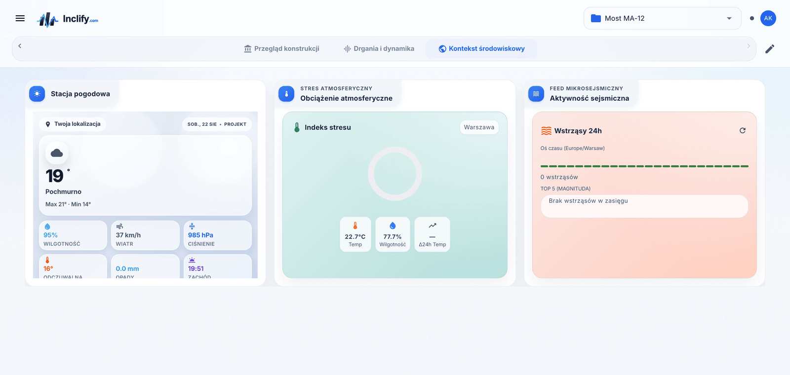
Weather conditions and meteorological warnings alongside data from the structure — because wind and frost explain more than one deviation.
Air quality data for the site location as environmental context for the monitoring project.
Water levels and flood risk for hydraulic and bridge structures — on the same dashboard as the sensors.
You drag, resize and group widgets without involving an administrator. Any dashboard can be tailored to its audience in a few minutes.
A structure does not stand in a vacuum
A gale, a thaw, a tremor a hundred kilometres away — all of it shows up in the data. Context widgets pull in public data and place it next to the sensor charts, so nobody has to open four services at once.
Conditions at the site location and active warnings — wind and frost explain more than one deviation on a tilt chart.
Water levels for hydraulic and bridge structures, on the same dashboard as the piezometers and strain readings.
Air quality data around the site together with a map view — environmental context for the monitoring project.
Recorded tremors on a map. An unusual dynamic event on site can be compared with seismic activity straight away.
A geomagnetic activity index — context for measurement installations sensitive to field disturbances.
Any RSS feed plugged into the dashboard — notices from the asset owner, the emergency services or your own dispatch system, next to the measurement data.
A plan, a cross-section or a photograph of the structure with the measurement points marked on it — a sensor stops being a symbol on a list.
Notes in a WYSIWYG editor, site documentation and embedded external pages — the operating instructions sit where the data is.
You arrange the dashboards yourself
Nobody outside knows better what belongs at the top of the screen in your control room. That is why the dashboard layout is on your side — no tickets to an administrator and no waiting for a release.
- Several dashboards in a single project — a separate view for the engineer, the maintenance manager and the control room screen
- An edit mode with widget dragging, reordering and duplication of ready-made layouts
- Widget width set separately for each xs–xl breakpoint — a phone does not inherit the layout of a 27" monitor
- A full-screen mode without navigation or browser chrome — for the screen mounted on the wall
- A custom icon and name per dashboard, so that with ten views you can still find the right one
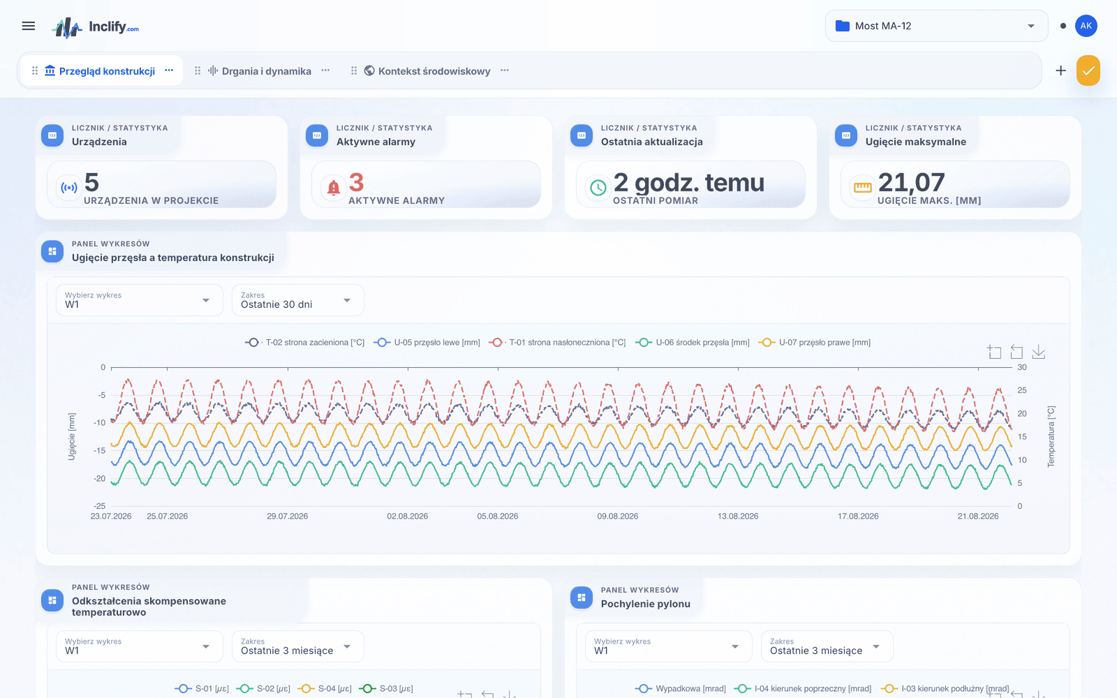
A panel that does not need the F5 key
Monitoring that has to be refreshed by hand is monitoring with a delay. Inclify pushes changes to everyone logged in the moment they happen.
- New measurements and alarm state changes visible immediately, without refreshing the page
- A connection indicator — you always know whether the panel is showing live data
- Full responsiveness: the same dashboard in the control room and on a phone during a site walk
- Several dashboards per project — separate views per structure, per crew or per report recipient
Everything the designer and the supervising body will want to see
The panel is there to be looked at, but the data also has to leave it — for calculations, reports and site documentation.
Exports without limits
Streaming CSV export of any time range, including multi-year ranges, and XLSX with FFT analysis results. The data comes out in a format any calculation tool will accept.
Project journal
Inspections, repairs and site events recorded next to the measurement data. You match a step on a chart with the entry “bearing replaced” instead of guessing.
Audit trail
100% of actions recorded: who changed what, when and to which value. Data isolation between organisations and user roles complete the picture.
The dashboard is the middle of the data path
Sensors and acquisition
More than 40 sensor types — vibrating wire, MEMS, inductive — and four data routes: REST, CSV/XLSX, FTP, existing data loggers.
Sensors for structural monitoring →Analytics and alerts
Calculation equations, reference measurements, warning and alarm thresholds, plus SMS, e-mail and push notifications in real time.
Monitoring data analysis →The whole platform
The architecture from sensor to decision: acquisition, calculations, dashboards, alerts and an audit trail in one system.
Platform overview →See the dashboards live
During the demo we will show the panel on a real monitoring project. Plans start at PLN 9,500 net per year.